


YOUR FRIDGE MAGNET GUIDE!
Ready to put this amazing kit to work? Dive into our inspo cards & color mixing guides to get the most out of your experience!
ACRYLIC PAINTING 101
Ready to put this amazing kit to work? Dive into our inspo cards & color mixing guides to get the most out of your experience!
Supplies
Color theory
Techniques
Workflow
Pro tips
Paints: Starter Palette
Start with these 6 colors and mix everything else from them:
Cadmium red
warm red
Cadmium yellow
warm yellow
Ultramarine blue
cool blue
Titanium white
most-used
Ivory black
use sparingly
Phthalo green
cool green
Our professional grade acrylic paints are perfect to expand your skills as you grow, as an artist.
Brushes

Flat brush
Large areas, sharp edges

Round brush
Details, fine lines

Fan brush
Texture, foliage

Filbert brush
Blending, petals
Surface
What to paint on
Canvas — most common, pre-stretched or board
Paper — acrylic paper or watercolor paper (300gsm+)
Wood panel — smooth, great for detail
Prime with gesso if not pre-primed.
Paper — acrylic paper or watercolor paper (300gsm+)
Wood panel — smooth, great for detail
Prime with gesso if not pre-primed.
Extras
Other essentials
Palette — stay-wet palette keeps paint workable
Water jar — rinse brushes often
Palette knife — mixing & impasto
Gesso — white primer
Retarder medium — slows drying
Water jar — rinse brushes often
Palette knife — mixing & impasto
Gesso — white primer
Retarder medium — slows drying
The color wheel
Primary
Red, yellow, blue — cannot be mixed from other colors
Secondary
Orange, green, violet — mix two primaries
Tertiary
Primary + adjacent secondary mixed together
Mixing
Key mixing rules
Add dark to light — dark pigments are powerful, use less.
To desaturate, add a touch of its complement (opposite on the wheel).
Avoid mixing more than 3 colors — it tends to go muddy.
To desaturate, add a touch of its complement (opposite on the wheel).
Avoid mixing more than 3 colors — it tends to go muddy.
Temperature
Warm vs cool
Warm colors (reds, oranges, yellows) advance — feel closer.
Cool colors (blues, greens, violets) recede — feel farther away.
Use this to create depth in landscapes and portraits.
Cool colors (blues, greens, violets) recede — feel farther away.
Use this to create depth in landscapes and portraits.
Wet-on-wet blending
Place two wet colors next to each other, then feather with a clean damp brush for soft transitions.
Dry brush
Load a small amount of paint on a nearly dry brush and drag lightly — creates broken, textured strokes.
Glazing
Thin, transparent paint layers over dry paint — builds luminosity and depth. Let each layer dry first.
Impasto
Apply thick, undiluted paint with a brush or palette knife. Creates visible ridges and sculptural texture.
Wash / watercolor effect
Thin paint heavily with water for transparent, fluid washes. Great for building tone quickly over large areas.
Sgraffito
Scratch into wet paint with a tool to reveal the layer beneath. Great for grass, fur, or fine lines.
Your first painting — step by step
1
Prepare your surface
Apply 1–2 coats of gesso if not pre-primed. You can tint gesso with paint to create a colored underpainting.
2
Sketch your composition lightly
Use pencil or a thin wash of paint to block in major shapes. This is just a map — no detail needed.
3
Paint background first
Work back-to-front. Cover large areas of sky, sea, or background. Use thinned paint at this stage.
4
Build up mid-tones
Add main subject colors. Let each layer dry before adding the next to prevent muddiness.
5
Add shadows and highlights last
Shadows are darker and cooler. Highlights are lighter and warmer. This gives your painting 3D depth.
6
Varnish when fully dry
After 24–72 hours, apply acrylic varnish (matte, satin, or gloss) to protect and unify the sheen.
Drying
Combat fast drying
Use a stay-wet palette — damp sponge + parchment paper keeps paint workable for hours. Or add a drop of retarder medium.
Brushes
Never let paint dry on brushes
Acrylic is permanent when dry. Rinse frequently while painting. At session's end, wash with brush soap and reshape bristles.
Consistency
Fat over lean
Start thin and build up to thicker paint. Thick paint on a thin layer can crack. Think: thin washes first, impasto last.
Mistakes
Acrylics are forgiving
Painted something wrong? Wait for it to dry (even 5 min) and paint over it. You can rework any area indefinitely.
Depth
Create light and shadow
Split any object into 3 zones: light side, shadow side, and midtone. This rule instantly makes paintings look 3D.
Color
Don't use black for shadows
Pure black looks flat. Instead, darken with a complementary color, or mix ultramarine blue + alizarin crimson.
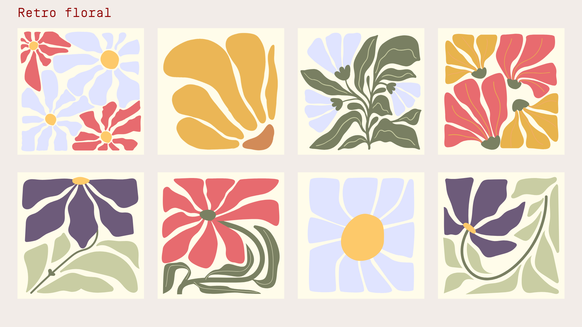
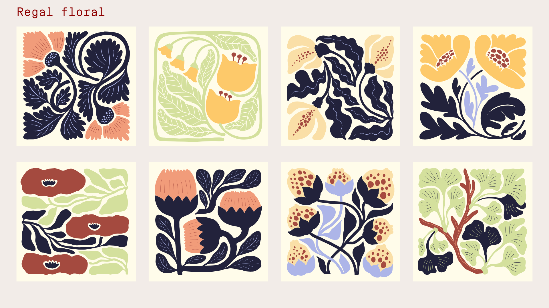
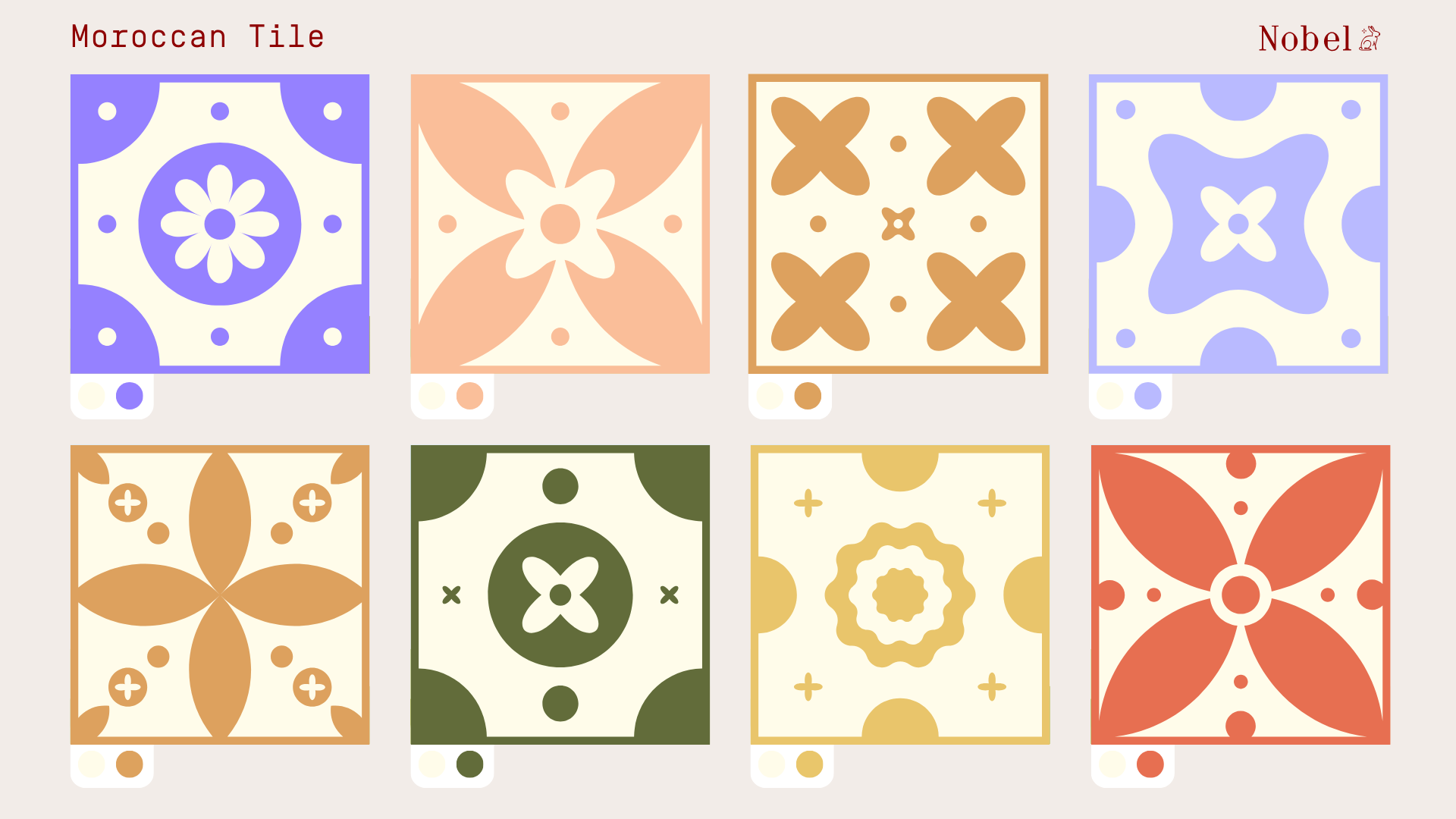
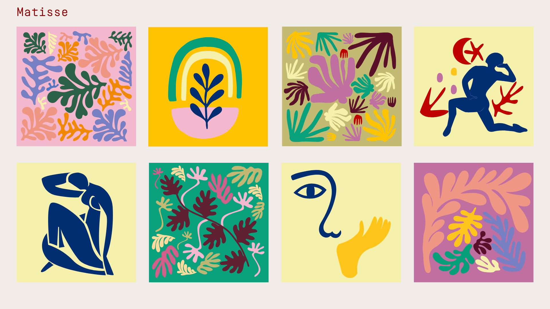
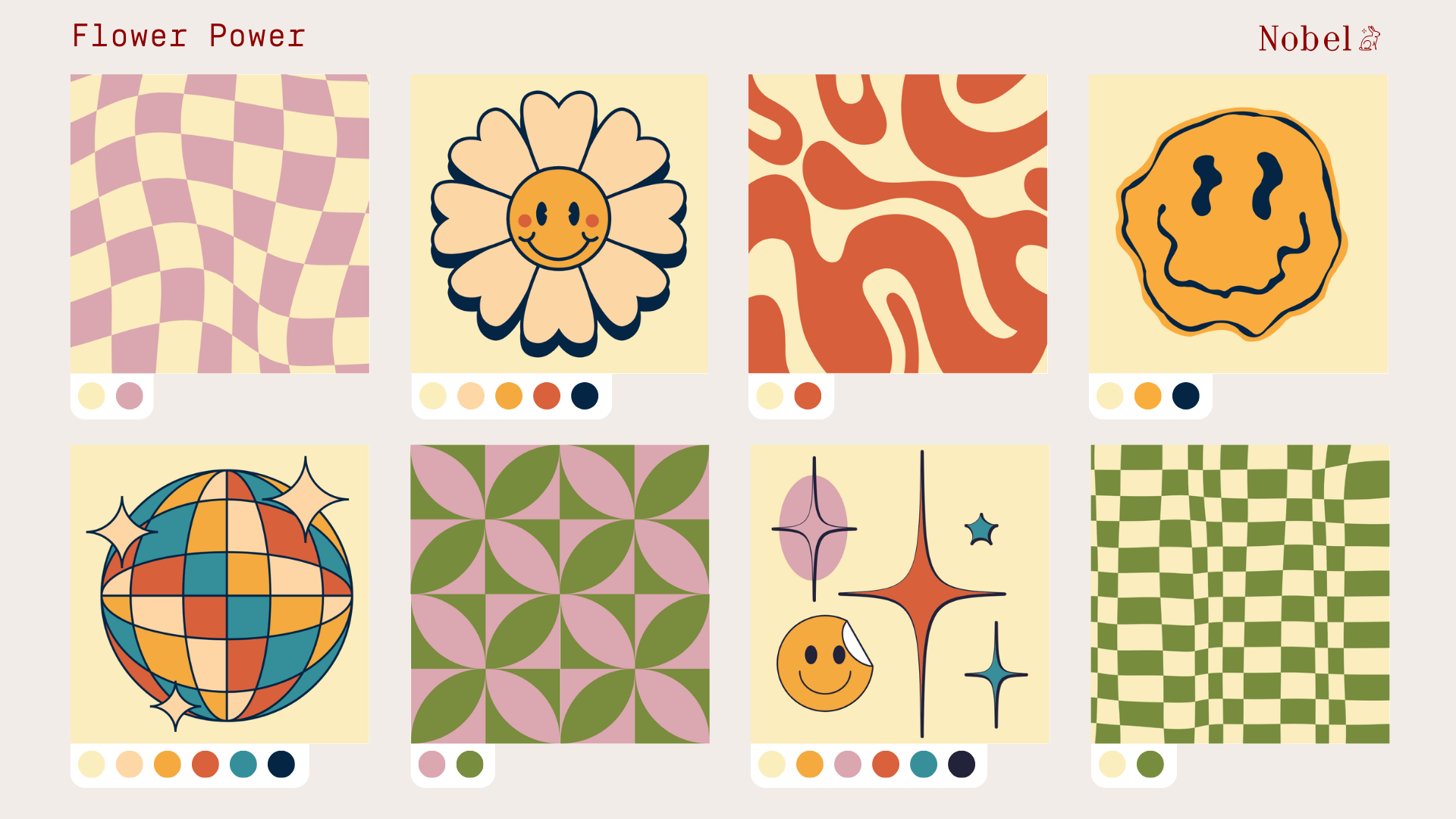
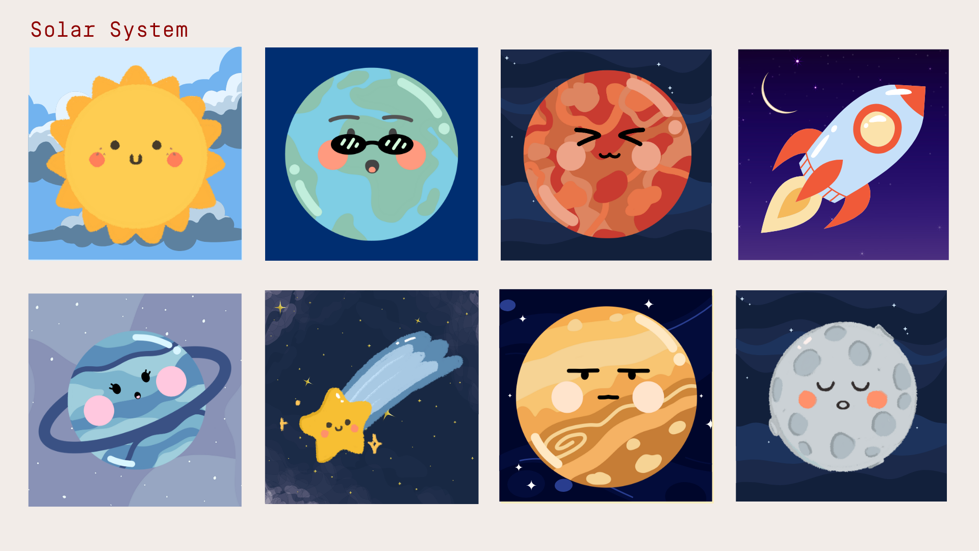
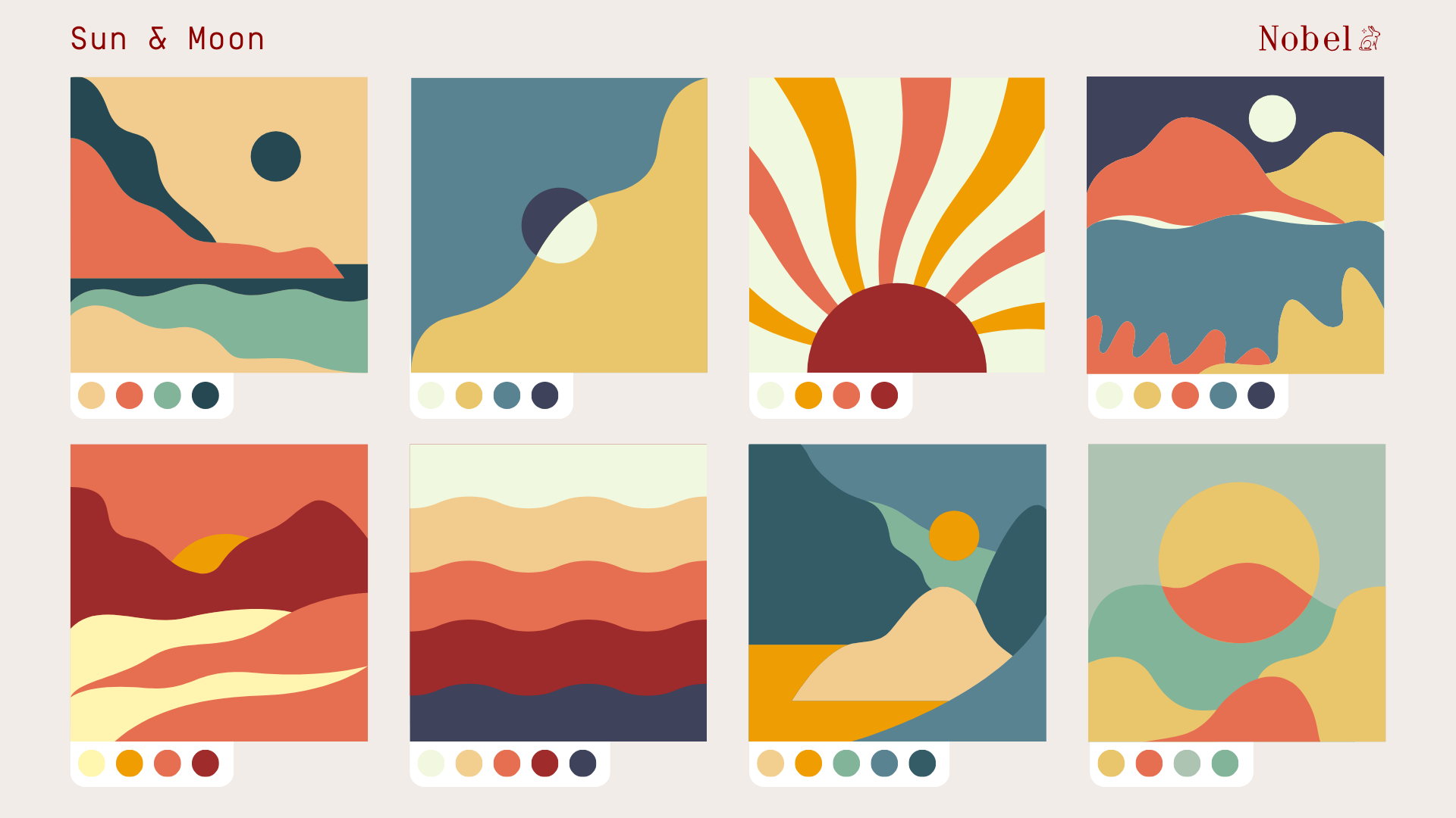
INSPO GALLERY
Find your inspiration & swipe to learn how to make it!
just open, smile, and start making memories that magnetize
EVERYTHING ARRIVES READY TO PLAY!


A NOBEL CHALLENGE!
Now with the mixing guides in hand, let's make some aesthetic fridge magnets!
We encourage you to share your creations on social media & tag us while you're at it ❤️


Cart
0
Your cart is currently empty.
Start Shopping
Trending Now
-

 Clean Flow Brush Washer $22.04 CAD /
 -

 Standard Canvas + Floating Frame From $21.76 CAD /GoldSilverWoodBlack WoodAvailable in 4 colors
 -

 Professional Grade Acrylic Paint From $5.80 CAD /Titanium WhitePermanent RedCrimson RedVermillionRed OchreScarletFluorescent PinkFluorescent YellowLemon YellowNaples YellowYellow MediumDeep YellowYellow OchreOrange YellowOrangeFluorescent OrangeSap GreenViridian GreenLight GreenEmerald GreenChrome Oxide GreenPhthalo GreenFluorescent GreenUltramarinePhthalo BlueCompose BlueCobalt BlueCerulean BlueVioletRaw SiennaRipe SiennaRaw UmberBurnt UmberBurnt SiennaVan Dyke BrownMars BlackBlackGoldSilverLake BlueBox of 5 Base ColorsAvailable in 41 colors
 -

 Individual Tempera Paint Block From $1.81 CAD /Brilliant RedCrimsonCherry RedOrangeYellow OchreDark YellowBrilliant YellowLemon YellowSiennaGreenLight GreenLime GreenDark GreenTurquoiseBlueBrilliant BlueDeep BlueLight BlueVioletPurpleBurnt UmberWhiteBlackAvailable in 23 colors
 -

 Nobel's Extra Fine Oil Paints From $6.05 CAD /Titanium White S1 (PW6/PW4)Lemon Yellow S3 (PY3)Light Yellow S3 (PY154)Orange Yellow S3 (PY64/PR4)Scarlet S3 (PR21)Vermillion S3 (PR4)Ultramarine Blue S2 (PB29)Prussian Blue S2 (PB27)Sky Blue S2 (PW6/PB15:3)Peacock Blue S2 (PW4/PB15:3/PG7)Phthalo Blue S2 (PB15)Light Green S3 (PY1/PG7/PY3)Medium Green S3 (PG7/PY154)Deep Green S3 (PG7/PY3/PB15)Raw Sienna S1 (PBR7)Yellow Ochre S1 (PY42)Red Ochre S1 (PR101)Burnt Umber S1 (PBR7)Raw Umber S1 (PY42/PR101/PBK11)Lamp Black S1 (PBK7)Available in 20 colors
 -

 Comet - Golden Synthetic Short Handle Brush From $2.20 CAD /
 -


-

 Pastel Crayon $0.53 CAD /RedRuddy PinkOld RoseOrangeYellowLime GreenGreenLight BlueBluePurpleBrownBlackWhiteAvailable in 13 colors


